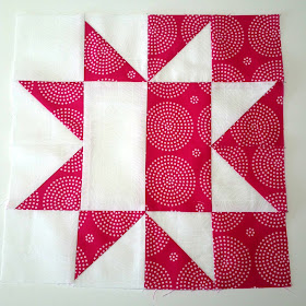
One of the great lessons I've learned in this brief amount of time (it started the beginning of January) is the difference color, hue, tone and saturation have on the outcome of a block. Take for example the block I constructed the second week, the Day Into Night block.
This blocks 'works', but I kept thinking about how the light fabric blended away into the darker fabric because of the business of the floral design. It bugged me right from the start, but I had the block made, so I thought, "Just go with it, Barb. It will look okay when you get more blocks around it."
This is what it looks like with more blocks around it:
Hmmm....okay, but not 'outstanding'.
To calm my muddled brain, I searched through my stash to find a nice white fabric with a background print (doesn't show up in the photo though), and I remade the block. And I'm so glad I did!
Here are the two blocks, side by side. Don't you think the pink and white block look better than the pink and floral block?
Yes, I was much happier with the pink and white block. And as an added benefit, I have an orphan block for my Orphanage Collection that I am starting!
The fourth block is the Cobblestone block, and I used a yellow solid with a colorful print.
I'm liking the way these blocks are coming together, and can't wait for Pat to issue the next block. Great fun for a winter's day.
And speaking of winter, I thought I'd add a photo of our mailbox.
Ordinarily, when I go to retrieve the mail and newspaper, the box sits chest-high to me. Now, with all the snow we've had, and even though the road is plowed out, I have to reach down to get the mail. Ah, this winter in Idaho is one for the record books! We've had four feet of snow that isn't going anywhere, and another 12-18 inches expected this week. After shoveling and plowing, what a great time for quilting!!!
Quilting with a smile,
Barb
Linking up to:
Oh, Scrap!
Linky Tuesday
Main Crush Monday


Great lesson in color and value Barb. Yes, the second star block is so much more effective! I had started the Tula Pink block collection and my first blocks all look awful because I did a similar thing, using values that are too close and prints that are too busy next to each other. I think I will have to ditch those blocks asnd begin again. They just look awful!! Always learning.
ReplyDeleteHope the mailman can still get mail into your box!
You are going to talk me into sewing along. I love your blocks so far. Great tip on watching out for contrast. Stay warm. That is a crazy amount of snow!
ReplyDeleteI think you passed us up in the snow department! Sheesh! This Idaho winter is nuts! I too like your second version better. Much more contrast. You have some fun blocks going on!
ReplyDeleteFabric contrast is always a hit 'n miss for me as well. You'd think after quilting for 40 years I'd have it figured out - but, it's always a fun challenge. I sure wish you could send some of that Idaho snow to us in Montana - we don't have any!
ReplyDeleteI love both the pink blocks! But I agree the higher contrast works better with the rest of the blocks you have.
ReplyDeletewow you have a lot of snow and quilt blocks. They look amazing. visiting from Oh Scrap
ReplyDeleteThat's a lot of snow! Very pretty blocks. You are going to have a fun sampler quilt at the end.
ReplyDeleteThank you for sharing your experience! Yes, the pink block is perfect! I'm amazed at the amount of snow you have! Here in southern NM, an inch or two is cause for me to bundle up and stay home! LOL! :)
ReplyDelete